
Journals25
Newest
Source Filmmaker Tips and Tricks Part 1
3 min read
So, you want to hear some of my tips and tricks of SFM, eh? Well, I decided to make this journal entry to help people who need to know exactly that. From how dark the sun's shadows are to how to make smooth movements, I give you BonBun Films' SFM Tips and Tricks!
...Part 1
We'll start with lighting. Either the only thing you need to make things look good or just a simple addition, lighting surely does make a difference. And the settings of said lighting can cause some interesting effects, like colours, shadows and even things as simple as the intensity. Let's go over the shadows first.
The two options in SFM for shadows in lights are the shadowAtten and shadowFilterSize. The lower the shadowAtten, the darker the shadow. The higher, the lighter. The lower the shadowFilterSize, the harder the edges of the shadow, and the higher the softer. Sun-rays and other organic light sources give a softer and lighter shadow, so for this you will need to up the shadowAtten and shadowFilterSize, but for lights like lamps and flashlights, the darker and harder the shadows, so you will need to lower the shadowAtten and shadowFilterSize. That's why despite there still being lights in games like FNaF, it shows no signs of sunlight and gives off that creepy night-time feeling. It's all down to the settings of the shadows. If you're trying to make a bright or outdoor scene in SFM, raise the shadow settings.
Next, we'll be looking at colours. This is probably going to be short, but it's still worth being looked at.
Colours are what gives your scene life. If your lights are plain white, it could still give off an interesting effect, but colours can make all the difference. Compare these two renders. One is with colour and one without:
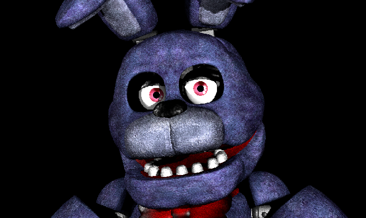
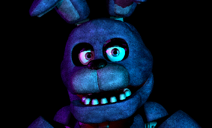
When using coloured lights in SFM, try not to make it too colourful. It could end up with the scene looking like one of those Typhoon Cinema thumbnails, and nobody wants that, right?
The best thing to do is to only have a few lights (for my example I only used 3) and make them either contrasting colours or similar colours. As you can see in my example, I used purple and blue. Some fairly similar colours. But also colours like blue and orange can do nicely. My point is, don't overdo it, ok?
Also, here's something about volumetric lights: They go nicely in dark misty or dusty environments. There's not much to say about this one really, just that It can sometimes be useful.
I think that's all there is to cover about lighting, look out for part 2 to learn about movements!
Join the community to add your comment. Already a deviant? Log In
So, this is the end, eh?
1 min read
What a ride. Five Nights at Freddy's was one of the best things that happened in my life. Been with me for 3 years, and has had an amazing impact on me. 30,000 subscribers, the talent of modelling and animating, lots more too. FNaF was a great series, but all great things must come to an end. If you don't know what I'm talking about look here: steamcommunity.com/app/506610
So, that's it, huh? The end of the main series. The End of Freddy's, if you will. Really, I feel like something died in me. But I'm happy for Scott anyway. I was never in the series for the books, the movie, or the spinoffs. I was in it for the main series, and if he's done with that, then I'm done with FNaF. Don't respect my opinion? Go ahead, unwatch me. If you can't respect my opinions, then you can't respect me.
So what will I do from now on?
Honestly, I don't know
But you never know...
Scott could just be trolling again...
Join the community to add your comment. Already a deviant? Log In
Join the community to add your comment. Already a deviant? Log In
Just wanted to clear something up
1 min read
I'm BonBun Films on youtube, I'm saying this because somebody asked.
Also this is a journal not a status because you're more likely to see it
Also this is a journal not a status because you're more likely to see it
Join the community to add your comment. Already a deviant? Log In
HAPPY BIRTHDAY BANTRANIC!!
1 min read
Happy birthday ma boi. Have a good one 


sorry for using your old model pls dont kill me
sorry for using your old model pls dont kill me
Join the community to add your comment. Already a deviant? Log In